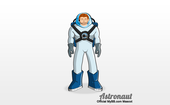
Early last year, we announced the development of an official mascot which would be used in a variety ways to promote MyBB and its official merchandise. After countless hours of hard work, we’re proud to unveil our lustrous new mascot.

During the planning stages, the MyBB team heavily debated on what would best represent MyBB. After numerous ideas, we finally decided on an astronaut, because we feel it best demonstrates the following attributes of our forum software: strength, power, friendliness and dominance.
However, the astronaut is currently unnamed; but you can help change that. We will be announcing a naming competition soon, so stay tuned for the details.

Is it a bird? Is it a pig? No! It’s the MyBB logo! It’s great that our users always find new ways of describing our speech bubbles logo but it’s getting quite old and the team decided, along with our new mascot, we needed a new logo too.
We’ll be using the new mascot and logo across MyBB when we launch 2.0, but we just couldn’t wait to introduce them to you!
Lastly, none of this would have been possible without the talented work of Mike Creuzer (if you’re interested in his services you can find him over at Audentio Design). We’ve been extremely honored to work along side him the past few months to bring you these new and exciting assets to MyBB.
Do you guys want a real name like well my name? Or, a fun name like spiderman?
My prescribed name would be “Dominant”. 😛
Just lovely. Mike doesn’t fail to amaze me, more power to MyBB.
Not what I expected. Though nice design. When does the new logo come in effect?
I like the mascot design, I think it’ll go a long way in promoting MyBB. The logo is totally sexy. All the more reason to look forward to the MyBB 2.0 release when it’s ready.
Cheers to Mike and the MyBB team.
Loving it! Keep up the good work mike.
Very different….lol
Great job though !
Great work guys. 😀
Name for astronaut: Astro
@Mark.M the new logo will be rolled out with 2.0.
Loving the new logo for sure. The mascot isn’t quite what I was expecting, but it’s still really professional looking and is sure to help improve the brand identity. I take my hat off to Mike for the amazing work he’s done here!
Cute astronaut 😉
Even cute, but powerful and dominant
I don’t understand what an Astronaut has to do with MyBB or any forum software for the matter. Quite puzzling.
Isn’t aquaman copyrighted ?
Somehow it doesn’t really appeal to me, the new logo does however 🙂
@Taylor Jones “We finally decided on an astronaut, because we feel it best demonstrates the following attributes of our forum software: strength, power, friendliness and dominance.”
@Ansem That gave me a good laugh. 🙂
George is a good name. Go for George! lol
Fine has been working. congratulations.
Cool, nice design.
This logo brought me back to the days when Yahoo IM was still a popular choice. This just reminds me of the avatars and stuff they allowed you to make.
I’m not sure about this new logo, the concept to me does not make sense. It is nice, do not get me wrong, just does not make sense (by the use of an astronaut).
The astronaut looks pretty cool, but tbh I don’t really like the shape of the bubbles (actually only the left one) in the logo and the font. I hope it isn’t final just some small changes would make it almost perfect. 😛
Awesome work team.
Thanks Mike for beautiful mascot.
The logo is quite usual but professional.
May be the mascot can be named a “ForoMan” or a “ForoNaut”.It sweeps easy with words.
Thank you,
Regards,
Dr.Envira
I kind of agree with Envira. The left speech bubble looks a little odd. But excellent work other than that insignificant bit!
Maybe the astronaut can be named Ben!
How about Jules, Verne, or Nemo?
Astronaut name: B. ByM. 🙂
I really had a nice work, congratulations:)
What about Mete? It’s short and have meanings in many languages.
How about naming him Bobby? MyBB’s Bobby. MyBB Bob. Something simple and to the point plus it uses 3 letters from MyBB itself.
I look forward to the new logo with 2.0.
Both look professional, and I think I’ll have to use Audentio Design’s services for when I get Leet Link back up and running.
That’s cool. I loved the new logo..
Great mascot guys.
I like it a lot, being retired from NASA/JSC and a spacenut since 3rd grade (9 yrs ). I think he should be named Astronaut Gus after Gus Grissom, one of the original Mercury Program astronauts who was tragically killed in launchpad fire. It would be a wonderful tribute, and a catchy name.
Nice mascot guys.I like this very much.Thanks a lot.Keep up the great work.
home page